/ 18
Logo
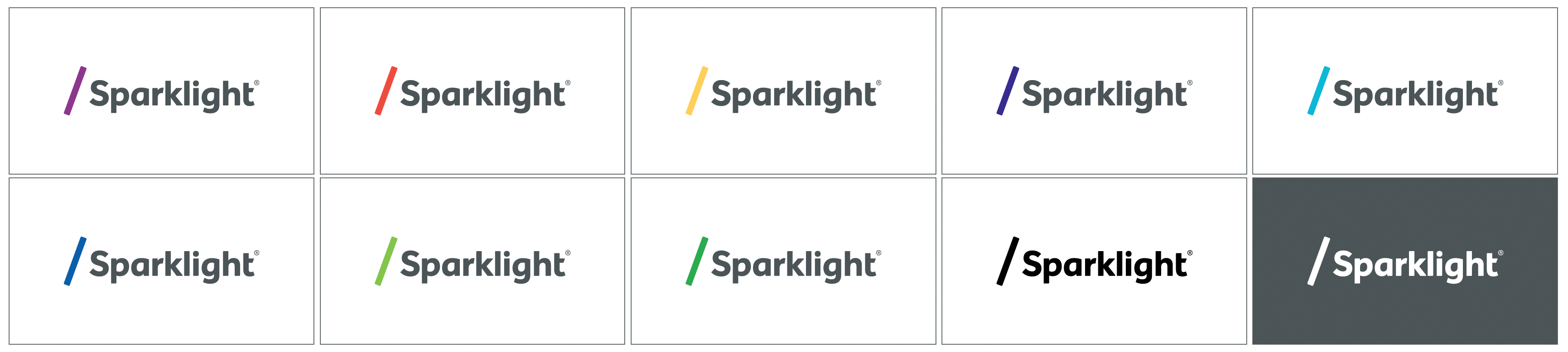
Residential Logo Lock-up
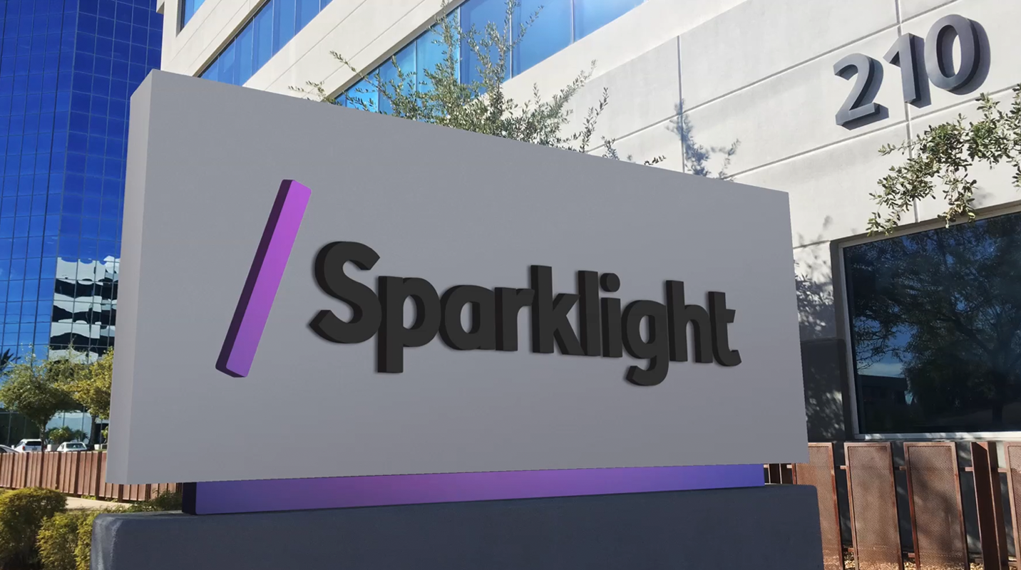
The Sparklight logo lock-up is our primary brand signature. It is comprised of two elements: a forward-leaning mark that references a forward slash found in web address urls to signal our shift from a traditional cable provider to a powerful ISP. Secondly, the mark represents a relay baton bringing the spirit of teamwork, collaboration, speed, and personal connection. Our logotype is drawn to complement the movement of our mark, and matching angles in the (“r,” “g,” and “t”) move the eye seamlessly through the lock-up.
Our signature is refreshingly simple, which allows for a dynamic expression of our company within our walls and to our customers.
The residential version of the logo is available in eight specific colors and should be used equally across all of our digital, print, and physical touchpoints and communications. The bright purple is the primary color. Note the black and white logo versions should only be used when printing is limited to one color or for increased legibility.
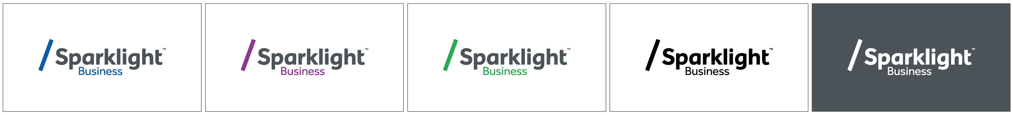
Business Logo Lock-up
Our business division uses a specific color palette and uses blue as its primary color.
Our signature is refreshingly simple, which allows for a dynamic expression of our company within our walls and to our customers.
The residential version of the logo is available in eight specific colors and should be used equally across all of our digital, print, and physical touchpoints and communications. Note the black and white logo versions should only be used when printing is limited to one color or for increased legibility.
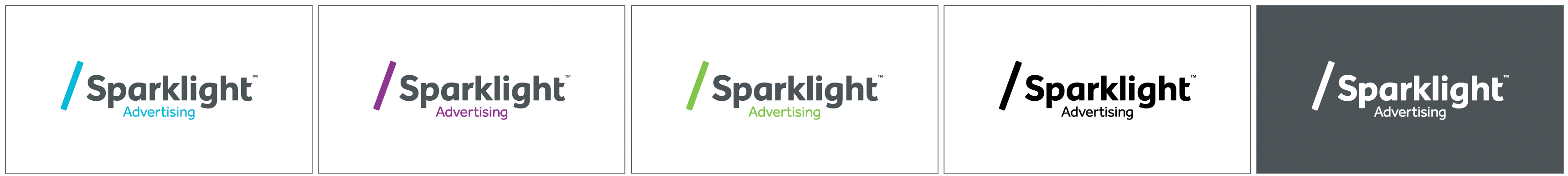
Advertising Logo Lock-up
Our advertising division uses a specific color palette and uses bright green as its primary color.
These three colors have been selected to create a consistent value for a more uniform appearance.