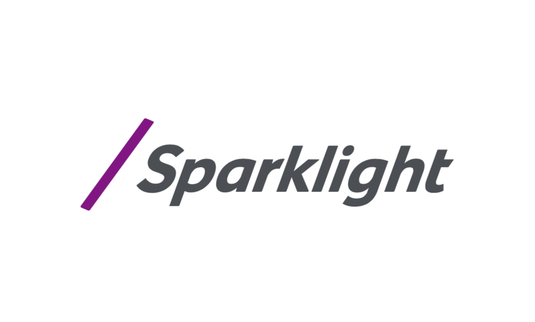
/ 19
Logo Lock-up - Clear space
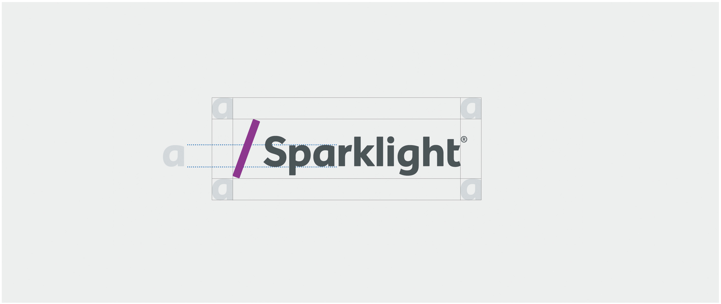
Make sure our brand signature is clearly visible in all communications. Surround it with ample clear space. We define clear space as an area free of type, graphics, and other elements that might cause visual clutter.
Use the size of the letter “a” as the minimal clear space measurement.
Note that the clear space specifications shown indicate the minimum area around the signature’s footprint. Use more space whenever possible to make our signature more prominent.
Logo - Miminum Size
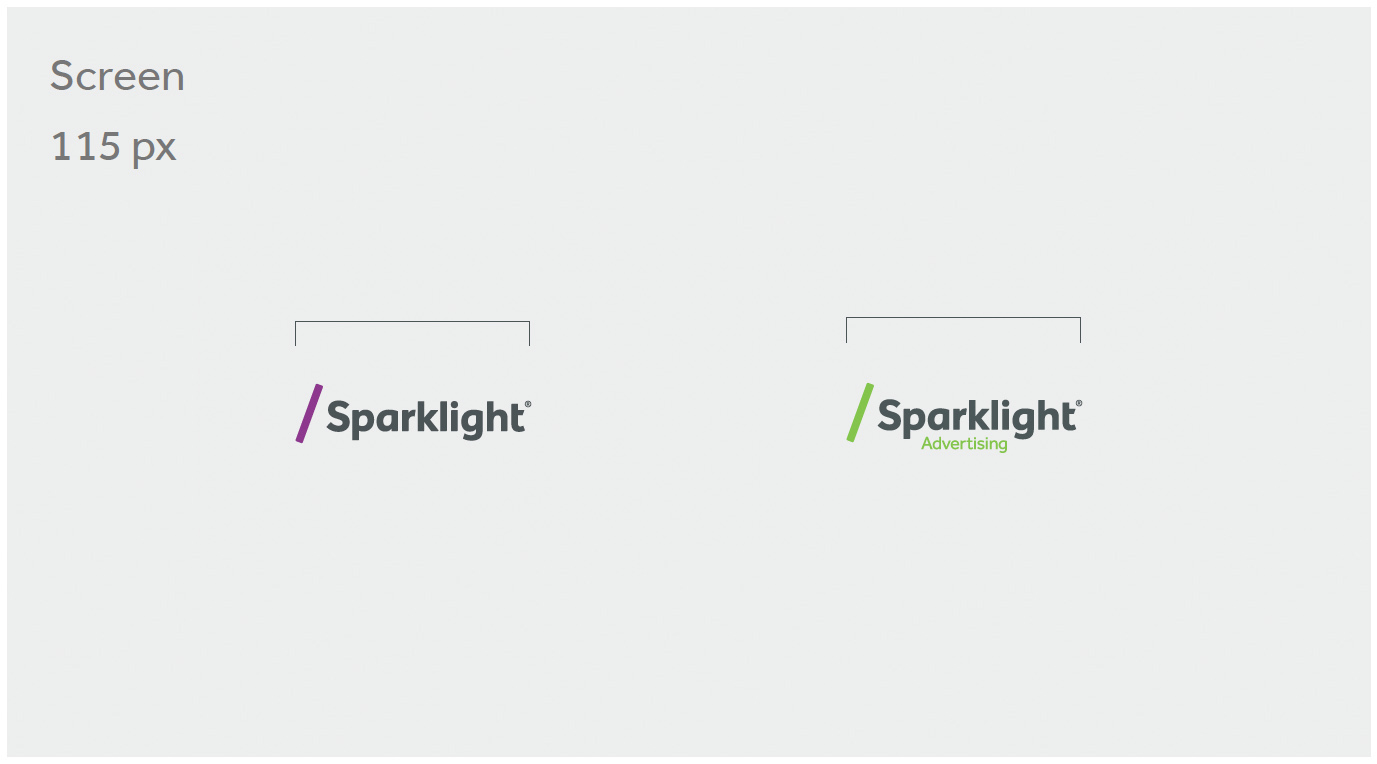
On occasion, our logo may have to appear at smaller sizes. To achieve the necessary impact and to ensure legibility, do not scale the logos below the recommended sizes in both print and digital applications.
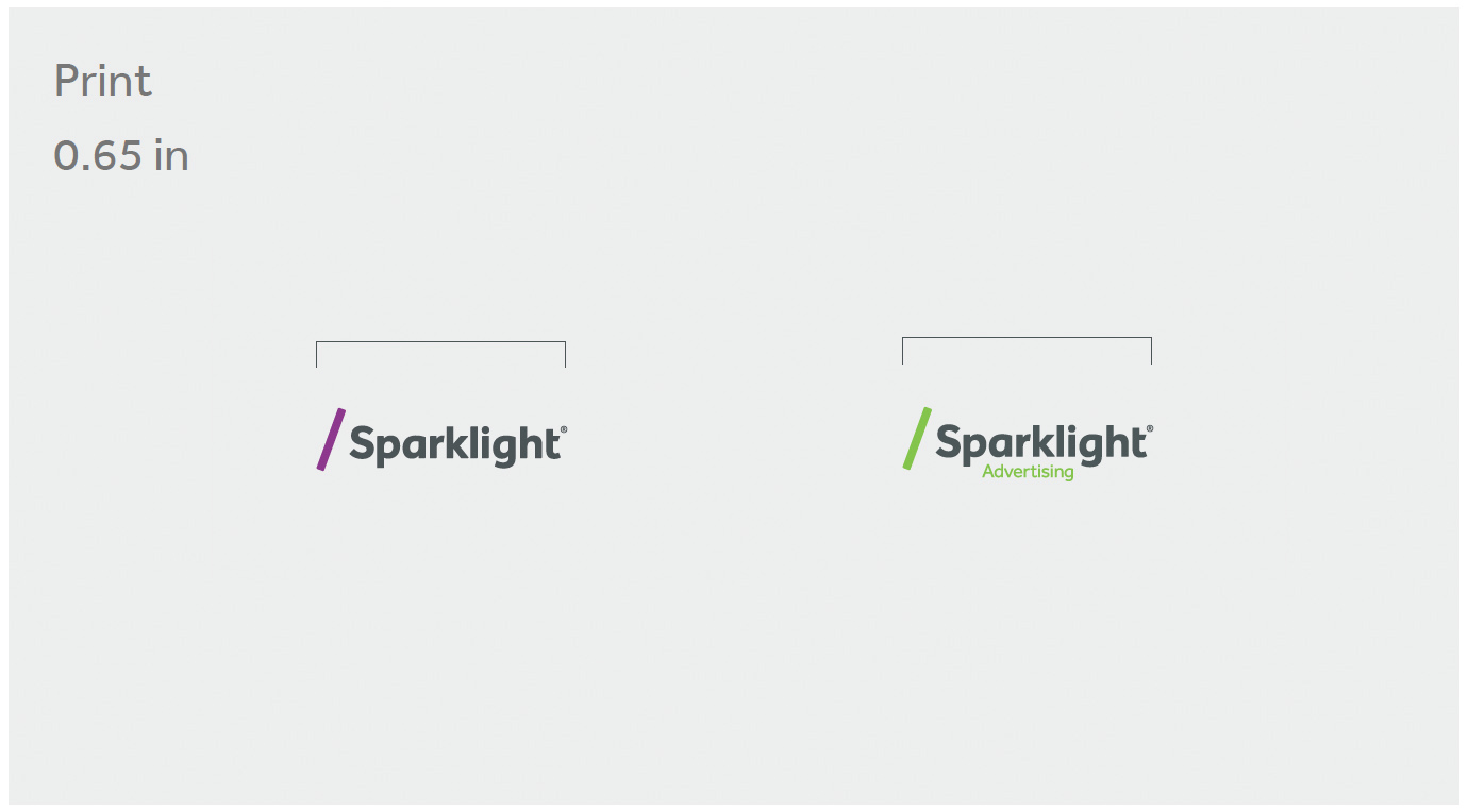
Special printing and reproduction techniques, such as silkscreen printing, embossing, foil stamping, or embroidery, will require larger scale to reproduce correctly. Always review proofs from a vendor to ensure legibility.
Logo - Dont's

DON’T render the wordmark in unapproved colors or gradients.

DON’T lock up unapproved descriptors or taglines with the wordmark.
DON’T recreate the wordmark in a different typeface.
DON’T skew or otherwise distort the wordmark.

DON’T add effects, such as drop shadows or bevels, to the wordmark.

DON’T outline the wordmark.
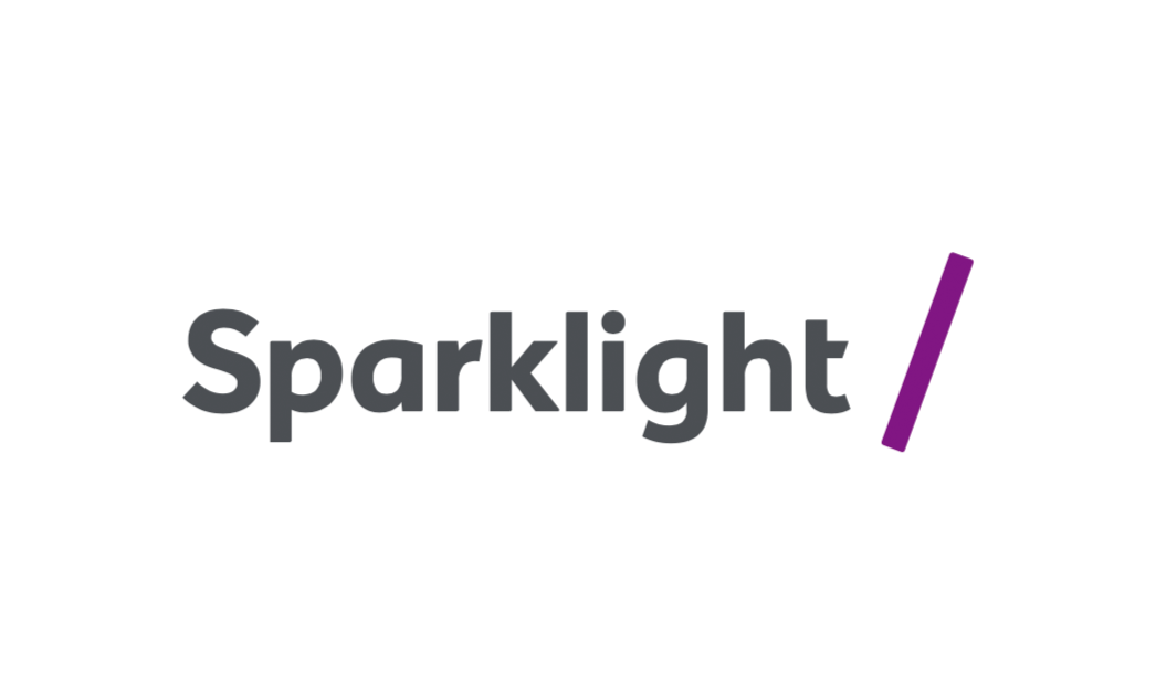
DON’T rearrange or resize the wordmark and symbol lockup.
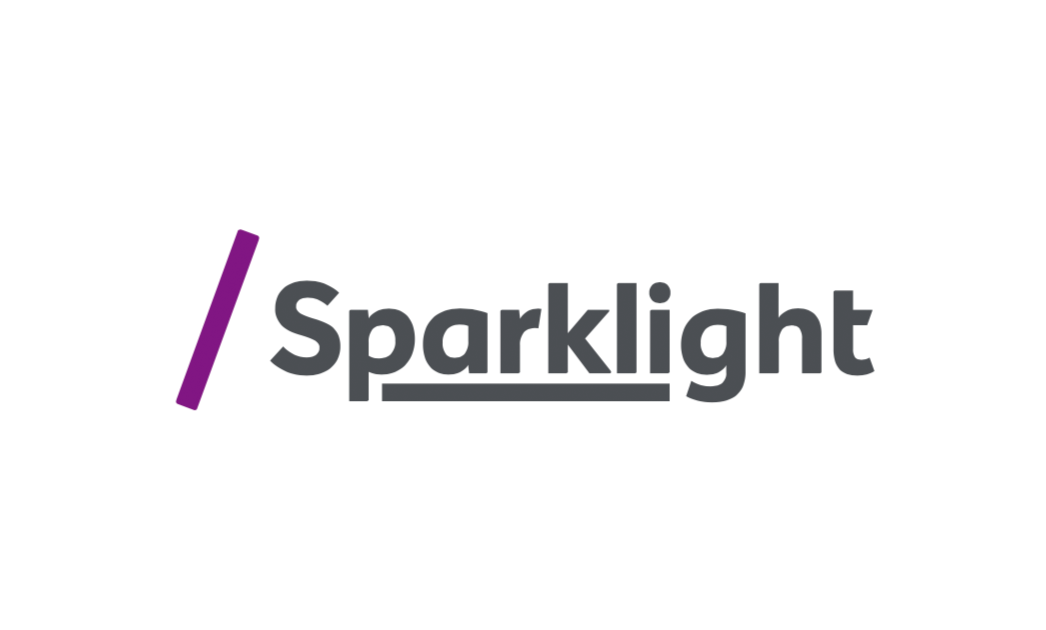
DON’T add additional design elements to the logotype.

DON’T place the logotype on a low contrast or busy background. On low contrast or dark backgrounds, always reverse the logo to white.