5.25" x 10" Acquisition Ads
Make sure all the headlines are short enough to fit on one line. Smaller pieces may require headlines that span multiple lines. Make sure to keep them simple and easy to read. The Sparklight logo, headlines, and subheads are always centered on our brand communications. Using the appropriate weight and scale of the typeface Effra will help create
dynamic layouts with strong visual hierarchy. Use the optical setting for all typography to enhance legibility. Whenever possible, the use of icons and/or symbols should be used to reduce the amount of text and enhance the ability for messaging to be consumed quickly and aid an easy understanding.
5.25" x 10"
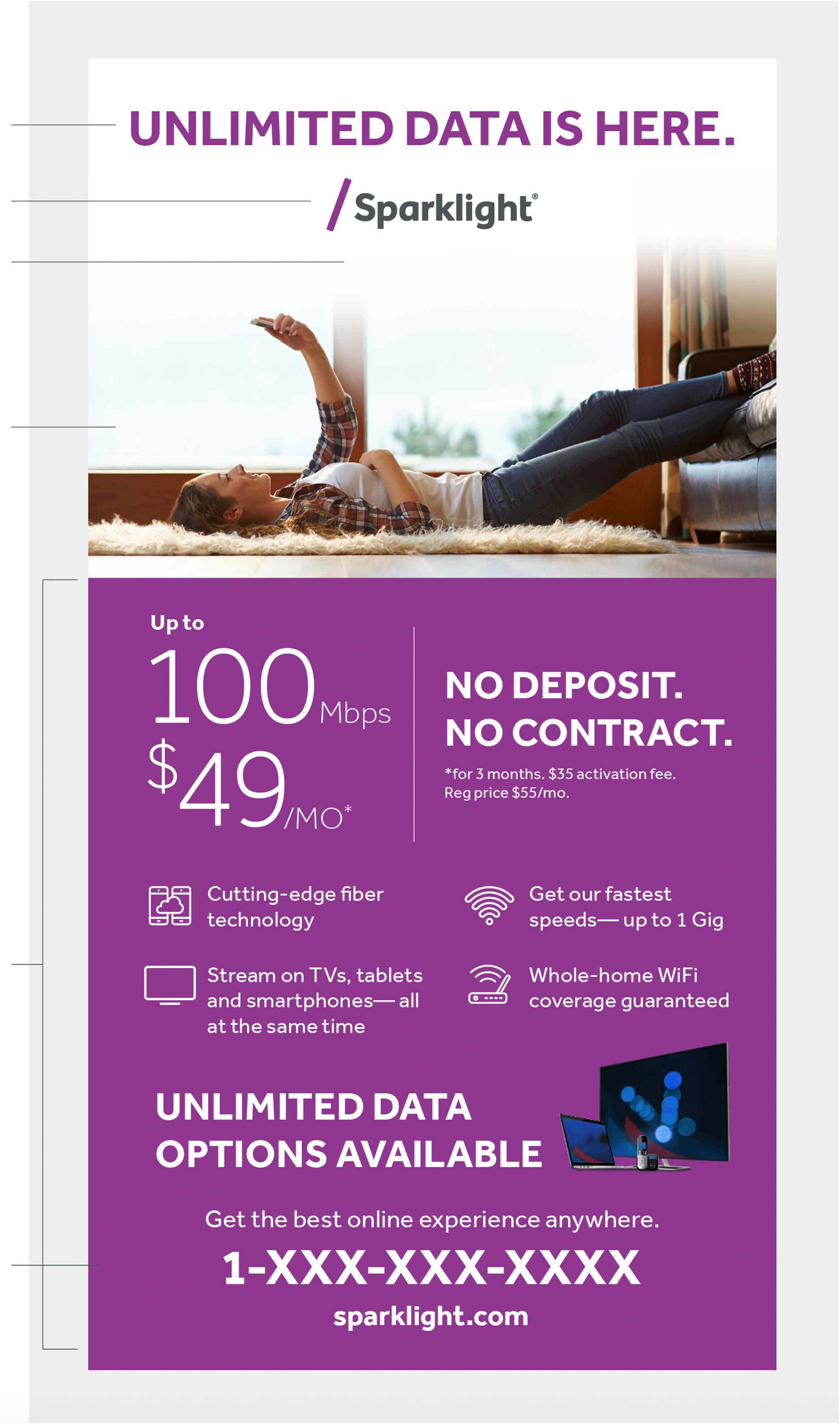
one line centered text Centered Sparklight
Bright Purple Logo Utilize fade on images
where needed Residential photography Relevant ad information within
colored block with white text Background color
Sparklight Bright Purple
Alternative 5.25" x 10"
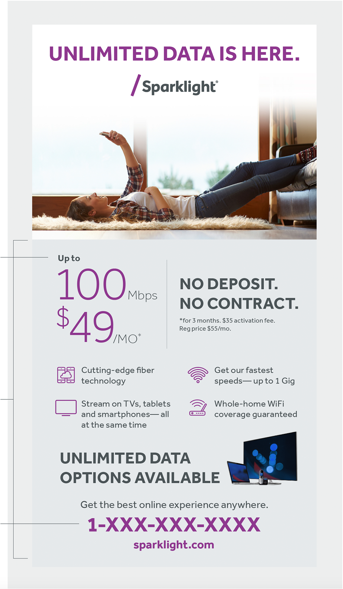
Sparklight Gray Background color
Sparklight Gray 10% tint Accent text color
Sparklight Bright Purple
10.5" x 10.5" Acquisition Ads
The use of flood color for container boxes should not be used in every single instance. Flood purple boxes work well to isolate content over an image with very little content, however, when the color is used
over multiple types of content with differing type sizes and weights it makes it harder for the viewer to discern what the hierarchy is. Alternatively, we can use reverse colors for easier legibility.
10.5" x 10.5"
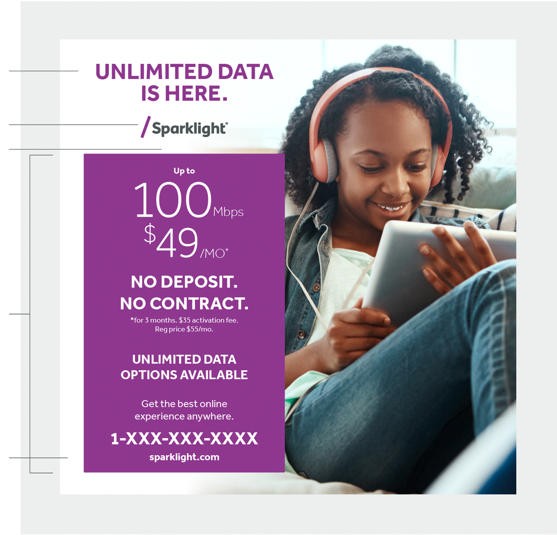
38pt / 36pt leading
two lines centered text Centered to box Sparklight
Bright Purple Logo Residential photography Relevant ad information within
colored block with white text Box background color
Sparklight Bright Purple
Alternative 10.5" x 10.5"
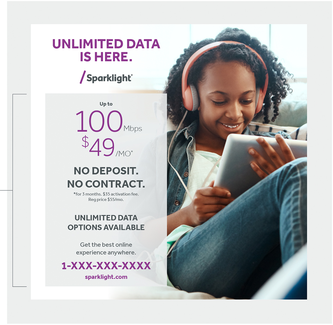
Sparklight Gray 10% tint
90% opacity
Brand Image Ads
Make sure all the headlines are short enough to fit on one line. The Sparklight Business logo, headlines, and subheads are always centered on our brand communications.
Using the appropriate weight and scale of the typeface Effra will help create dynamic layouts with strong visual hierarchy. Use the optical setting for all typography to enhance legibility.
5" x 4" Layout Option 1
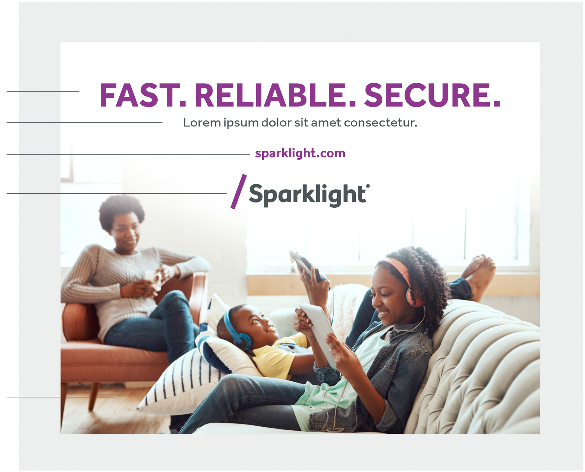
Sparklight Bright Purple text Centered Sparklight Bright Purple Logo Residential photography
5" x 4" Layout Option 2
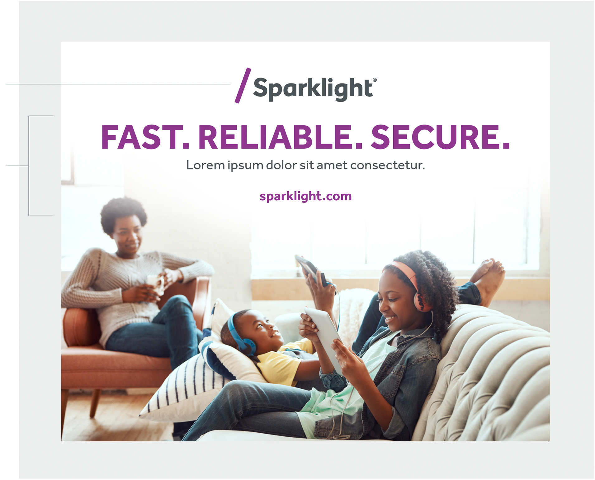
Logo moved to the top of ad Remainder copy moved below
Sparklight logo
